Stencil print - Rufous Songlark Sings

stencil art of a Rufous Songlark

Rufous Songlark is singing about the good things of Summer.

The Rufous Songlark is a small bird native to grasslands of Eastern Australia. Each Summer the male bird sings almost constantly.

This 2 colour stencil design was originally cut and hand printed to be part of the Bimblebox 153 Birds Project. 153 printmakers have each represented one of the 153 birds known to use the Bimblebox nature refuge. This nature refuge in central Western Queensland, Australia, is to be destroyed as it is in the path of a mega coal mine.

The prints contributed to the 153 Birds Project now form a touring exhibition raising awareness about the plight of the nature refuge and the potential threat these vast coal mines represent to the biodiversity of the region.


Visit Pixbyrichard on Redbubble 
to shop for Rufous Songlark Sings on gift cards, giclee art prints and home decor


spruced up the website

octopus illustration

Too often have I thought 'Must update my portfolio website' and gone on to do exactly nothing about it. Well a few days ago I broke with this long standing tradition. I reviewed and changed my portfolio images and updated the layout of my website and blog. I also gave the site a shiny new domain name www.richardmordenillustration.com.au

My aim was to make a site visually clean and simple to navigate. All the information a potential customer needs is on one page. No need for a separate landing page, folio page, contact page or about page. The website is built with blogger so folio images are easy to update and the responsive blogger layout means all should look fine on a mobile device.

You will notice inky octopuses in the side bar. These tentacled critters were painted as decorative devices to visually break up the text and give the site some added personality. I took photos of the octopuses on the drawing board. Here they are...


a bench for my studio space

cheap standing height bench for my art studio

I made a bench for my studio space. The working surface is a lot higher than is typical for a work bench allowing me to comfortably draw at it when standing up.

I have to admit most of the work was done by the local hardware store. I asked them what I should do to make a cheap standing height bench to be used for light work, mostly drawing. They suggested the basic construction you see here and sold me a light hollow door, 3 metres of 70x35mm pine which they cut to the required lengths, some screws and drill bits. All that remained for me to do was drill pilot holes and screw the lot together. Even I could manage this.

And because I am much better at illustrating diagrams than I am at timber constructions here's a very basic isometric projection of how the bench went together.

isometric projection of my standing height work bench


illustration of a decorated cat skull

illustration of a decorated cat skull

Illustrators Australia and Redbubble
have collaborated with a gallery show of t-shirt art called Wear Art Thou.

As a member of Illustrators Australia I was invited to join in on the fun. The invitation came in May, but being distracted by work I only remembered the show when there was just 10 days left to think up a design, create the artwork and enter. Ahhh, pressure!

In a lunch break at work I scribbled a quick list of ideas then discarded most for being unsuitable for a t-shirt, or simply being too tacky. The idea remaining was to illustrate a skull.

The thought process went - Skulls are always popular on clothing, but skulls on t-shirts have been done to death (pun!) so it would need a point of difference. How about a cat skull? Cats are always popular on the inter-web, and I am super fond of them too. Might turn out a bit nasty looking, better soften it up with some sort of whimsy. Flowers would be ideal. Our last cat was called Wasabi, I could use flowers and leaves from a wasabi plant, making the image into a tribute for her. Awww, how sweet. So now the skull won't be scary, it will be poignant. Yep, lots of boxes ticked.

In a way it is actually two paintings: the first an airbrush style illustration of a cat skull, the second a naive painting of leaves and flowers appearing to wrap around the skull. The texture in the background is a photograph of the cement floor in my studio space.

This artwork was created to sell on line on a variety of products, so here comes the sales pitch...

Cat skull decorated with wasabi flowers is available to purchase on line via Redbubble 
on t-shirts, throw cushions, tote bags, posters, prints, stickers and gift cards.
Easy to order and delivered to your door


aardvarks and flying saucers

illustration of aardvark and UFOs

We have here yet another cover illustration for Ethel the Aardvark

Forward Aardvarkia is loosely based on an example of British wartime propaganda, but features a mysterious, suit wearing aardvark and a fleet of flying saucers.

It looks like an acrylic painting but is actually rendered with the mixer brush tool in Photoshop.
Just in case you are interested, this is the rough sketch. I scanned it and 'painted' over the top.

I like the juicy brush stroke detail the mixer brush tool can make, however it is not as intuitive or as fun as using a real paintbrush


Christmas aardvark

Christmas Aardvark
Cover art for another Ethel zine. This one features an aardvark in a Santa hat, packing a box of books.

Ethel the Aardvark is the bi monthly fan-zine which goes out to members of the Melbourne Science Fiction Club. I am one of the two editors.

It is by far the nerdiest publication I have ever had anything to do with, which I have to say is something I enjoy.

Bah Humbug Christmas card art

Bah Humbug Christmas card art

A hand painted visual pun combining the boiled sweet known as a humbug with Ebenezer Scrooge’s famous catchphrase 'bah humbug'.

I realised after posting it online for people to buy as printed Christmas cards or t-shirts that not everyone was going to get the gag. It depends on whether or not you know of two things: boiled sweets called humbugs and at least passing knowledge of Charles Dickens' story A Christmas Carol. So if you get the joke, pat yourself on the back and feel smug.

If you didn't get it, thats's okay. You are not alone! Upon finishing the quick painting it was shown to a room full of friends who all looked at me in confusion. Oh well.

The Bah Humbug card art is not at all intended as anti Christmas sentiment, rather it is a wry acknowledgement of how stressful the lead up to Christmas can be, especially for those of us not organised enough to shop for presents in October. I always end up buying gifts at the last moment. Bah!

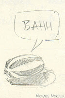
Following are the initial concept sketch and the acrylic on craft paper painting. You can see the painted image was digitally edited before posting it on-line as final art. This was because the craft paper, while nicely textural wasn't very Christmassy. So I gave the background a lustrous green hue. Seems to suit it.


Bah Humbug concept sketchBah Humbug in progress


This design is available on Erdbubble as beautifully printed
Bah Humbug Christmas cards or a Bah Humbug Christmas t-shirt


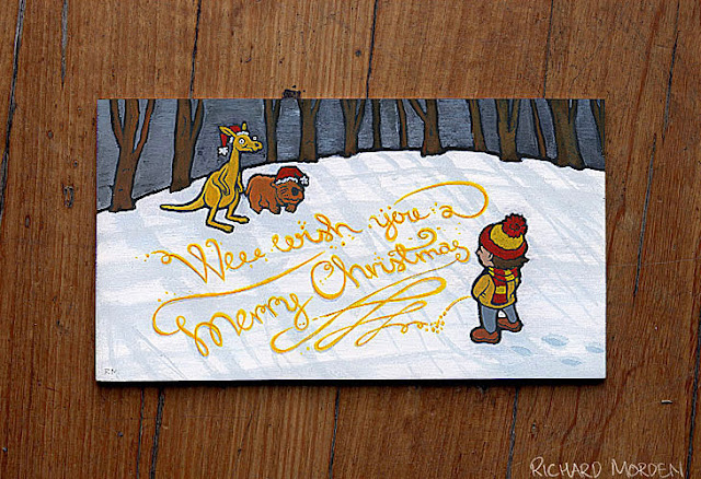
wee wish you a merry Christmas

wee wish you a merry Christmas card art

Wee wish you a merry Christmas
available as printed Christmas cards

I have an artwork in... the Illustrators Australia Annual 9x5 Exhibition 

The exhibition is at St Helliers Gallery, Abbotsford Convent
From October the 19th to November the 3rd

The theme is 'FLOURISH'
Each artwork has been done on a 9x5 inch piece of plywood

If you happen to be in the vicinity of the Abbotsford Convent over the next couple of weeks this exhibition is worth popping in to have a look at. I promise most of the works are more tasteful than mine.

For further details and to see previews of the artworks
see the Illustrators Australia page about the exhibition

Responding to the theme 'Flourish'

Illustrators Australia like to give us a tough theme each year for this group show. Flourish was no exception to this rule. I struggled for weeks with what to do.

I decided if I was to spend hours doing an artwork it may as well have some sort of practical application. A Christmas design I can sell as cards fits the bill pretty well. Great idea but I still didn't know exactly what I should be painting.

Three days before the deadline, exasperated, I commented flippantly to my partner "Why don't I just paint some kid peeing a flourishing Christmas message into the snow".

A concept of questionable taste.

Painting process

I tried a painting technique I have seen others use to great effect - starting with a dark background and painting light shapes over this to create form, leaving gaps to make outlines. Sounds easy, but nothing is ever easy. Especially painting.

And snow, what made me think painting snow would be a good idea? Snow is a bugger to paint, especially in acrylics which dry substantially darker then when you apply them. I now hate snow.


I wasn't totally unhappy with the end result, but it was an exasperating journey with brushes not acting as expected and colours not looking as intended. I don't do much painting. Maybe these vexations are just part of the deal.

Any painters out there, what say you? Painting always tricky, or does it get easier with practice?

fan-zine artwork

science fiction cover illustrationscience fiction cover illustration


Well that's the fanzine for my sci-fi club sorted for a couple of months.
Phew! *wipes sweat from brow*

This issue featured many wonderful contributions of images and articles by talented Melbourne Science Fiction Club members. Good content certainly makes for a good zine. Alas the contributors' artworks are not mine to show you here, however I can show you the few pieces I did for the issue - the cover illustration and a couple of author portraits.

As the current graphic editor/designer of Ethel the Aardvark, the bi monthly fan-zine of the MSFC, I regularly need to quickly create visual content to accompany articles. So I have been using the zine as a bit of an experimental playground to tinker with illustration styles and techniques.

The cover for this issue has a faux aged paper texture with corner creases incorporated into the artwork. The aged texture is a scan of an old book's plain back cover and the illustrated elements are derived from old artworks of mine. The theme of this issue was Space Opera. I wanted the cover illustration to evoke the look of a well used, dog-eared novel of space faring sci-fi drama.

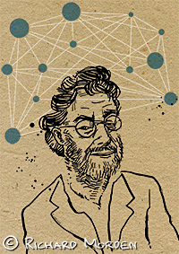
The portraits are of two well revered science fiction authors who recently passed away, Jack Vance and Iain M Banks, both of whom are the subject of tribute articles in this issue.

illustrated portrait of Jack Vanceillustrated portrait of Iain M Banks

zoomorph animal cards and t-shirts


Deer cat

A cat with deer antlers

deer cat stencildeer cat

Horned dachshund

Dachshund with the horns of an oryx.

horned dachshundhorned dachshund

Moose mouse

A mouse with moose antlers
    
moose mouseMoose Mouse

Winged rabbit

A rabbit with bird wings

   winged rabbit stencil

Octopug

A pug with the body and tentacles of an octopus
   
octopug stenciloctopug stencil

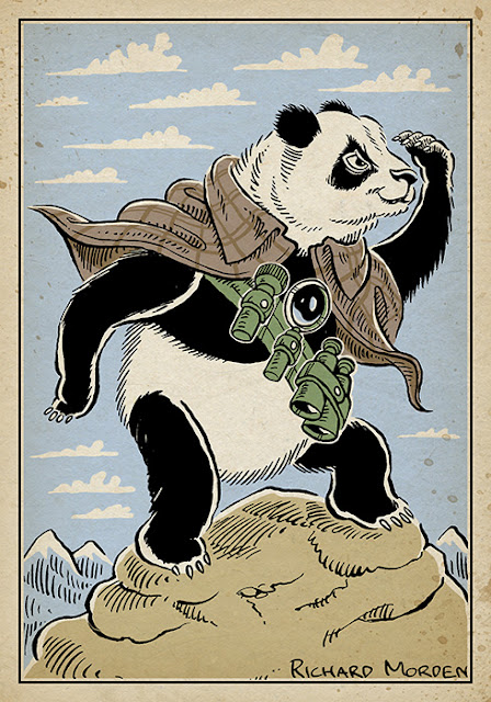
vigilant panda

vigilant panda illustration

Vigilant panda possesses incredible powers of vision and insight. It is ever alert and prepared for adventures and mighty deeds. An unusual commission from a few months ago.

He wears an Inverness cape, in homage to the super sleuth Sherlock Holmes. Prior to this commission I would not have known what an Inverness cape was. Oh the things you learn as an illustrator.


Space Neuron

Probably should be pronounced as
Spaaaaaaaace Neurrrrrrron
with an echoing dramatic kind of voice

It has been far too long since I've posted here. So here's a quick artwork to get back into the swing of things.

Space Neuron was intended as a quick editorial illustration to accompany an article written in memory of a sci-fi fan. I wanted it to have a bit of an enigmatic spacey vibe. Note the gratuitous lens flare - so cheesy, but I couldn't help it.

space neuron


Christmas cover collage

collage - Robot space santa battles the time bombs of destiny
Ethel the aardvark, the MSFC bimonthly fanzine, is now off to be printed.

For graphic content old images were collected based on the themes Christmas, time, and space... and koalas. These and all the scissors and glue I could get my hands on, were shared with a bunch of fellow sf fans. We spent the evening constructing collages.

Theirs were done with honest scissors and glue, mine were done digitally. 
Here is the zine cover art featuring a robotic father Christmas.

Cthulhu menaces the planet Earth

Cthulhu menaced the Earth

This photograph was taken to go into the October/November Edition of Ethel the Aardvark, the Melbourne Science Fiction Club's bimonthly fanzine, for which I am currently the layout guy (so I get to decide on what artwork goes in - oh the power!) It was intended to go into the zine as a random art image with vague Halloween overtones. You will be happy to know I put the photo on page 13.

All taken in-camera, except for the grungy texture which I found on the underside of a baking tray.

I bought the pink Cthulhu plush toy off KRin Pender-Gun of Pink K Designs at a club mini-convention a couple of years ago. The globe is actually a pencil sharpener, the stars were cut out of aluminium foil and the background is a velvet garment.

Here's the concept sketch

Cthulhu menaced the Earth concept sketch