more Beautiful Soup

Silly me, I didn't think to post any images of the print I created for the Beautiful Soup exhibition. So here are some pics.

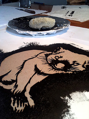
back foot of a Northern hairy-nosed wombat
lino cut, block ink, kitakata paper

lino cut of a wombats back foot
wombat foot linocuts drying
linocuts drying

Northern hairy-nosed wombats are critically endangered. Their footprint on this world is a tiny one indeed.

The exhibition is still on for a while and the wombat's foot is only one of the 56 prints in the show, so if you are in the area do go have a look. There is so much beautiful, original artwork there and it is all for sale.


St Heliers Street Gallery
10 October – 4 November 2012
The Abbotsford Convent
1 St Heliers Street, Abbotsford, VIC 3067
open: Mon – Sun 8am – 4pm

Beautiful Soup

Hey, I am part of a group exhibition!
An exhibition of prints by 56 artists, curated by Rona Green.
If you are in the area of the Abbotsford Convent pop in for a squiz.


Beautiful Soup showcases an amazing array of all kinds of prints including etchings, linocuts, woodcuts, drypoints, screenprints, lithographs and more, by a host of wonderful artist printmakers. Of all the beautiful small scale works on exhibition there is only one of each artists prints framed and available for sale, so works on paper collectors are advised to get in quick – this is a great opportunity to do some early xmas shopping! Prices range from $130 to $400.

Visit www.ronagreen.com/soup to view the online exhibition catalogue
launched 14-10-2012

All are welcome to join the artists for celebratory drinks at the official opening from 2-4pm on Sunday 14 October – entry to this event is free.

St Heliers Street Gallery
10 October – 4 November 2012
The Abbotsford Convent
1 St Heliers Street, Abbotsford, VIC 3067
open: Mon – Sun 8am – 4pm


spuds and staffies

I know it is a bit cheesy doing faux stencil and splatter images, but digital art is usually the quicker and simpler way to do a freelance illustration gig. The customer wanted grungy street art styled images so I created vector images which look like hand painted stencil art.

These images are part of a range of graphics for a fish and chip shop.


book cover illustration for The Artemis Effect

A little while ago I was asked if I was interested in designing a cover for an ebook.

The book is The Artemis Effect by author Kasia James. It is a character driven story set in the near future, and follows the adventures of three people in different countries who must survive a world-wide collapse of communications, technology and society.

How could I say no?

cover art for an ebook The Artemis Effect by Kasia Kames


We all know a cover isn't just a pretty picture with some text - it is one of a book's most important promotional assets. So I read the book, then the author and I had a number of discussions. Based on these discussions I presented a selection of rough concept drafts before we settled on one, which was then worked into final art.

Our priorities were to
  • indicate something of the story's content, style and genre
  • create a design which communicates to the right audience
  • for the title and author's name to be very clear, even when previewed at tiny sizes

I could go on about all the careful cover design choices made, but actually I don't want people to see a bunch of design decisions, I simply want people to think "Yeah, characters I can identify with dealing with an end-of-the-world-as-we-know-it scenario... this book is for me!"

Do you think we succeeded?

You can buy The Artemis Effect here (Kindle edition)

You can find Kasia James' blog here

devil prints

tasmanian devil stencil
Spent this morning printing some devils. No, not demon figures with horns, but the furry marsupial variety. Tasmanian Devil - marsupial carnivore the size of a small dog with a large mouth and big teeth. They are facing extinction in the wild because of Devil Facial Tumour Disease.

I designed this stencil as one of two options for a joint show I am involved with. I ended up going with the other option, a linocut of a wombat's foot, but now I am unsure of my decision. Such nagging doubts.

The stencil is based on a photo I took ages ago.

stencil paper
scalpel
acrylic paint
sponge
elephant dung paper


tasmanian devil stencil

tasmanian devil stencil

tasmanian devil stencil

tasmanian devil stencil

tasmanian devil stencil

found in local shop

Today while checking out the local second hand shops I was surprised to spot a couple of familiar faces.  Designed these little toys years ago as characters for collectable ranges.
I immediately bought them of course, but what am I going to do with them now? Dunno. Cool to find them all the same.

toy designs by Richard Morden

Dinosaurs asleep - poster illustration


illustration of sleeping dinosaurs under a city


The Illustrators Australia A3 print show is over and I have picked up my prints.

And a big surprise, I recieved the A3 Show Peoples Choice Award with my print 'Dinosaurs Asleep' :)

There was a little box people could drop their People's Choice votes into and somehow an image of sleeping dinosaurs under a city caught enough peoples attention.

So thank you to Illustrators Australia for organising the fine event, and thank you to fine art printers Image Science for sponsoring the award - the print voucher and monitor calibrator will both be very handy. I had Image Science print my A3 artwork for the show - they did a high quality, fast and friendly job, as always.

My Peoples Choice vote actually went towards Gregory Roberts' piece Life in the paddock. A clever beautiful image and totally right-now.

At the opening I found an abundance of excellent work to admire and loads of friendly, talented illustrators to talk to and be quietly in awe of. In particular I had a great time chatting to fellow illustrators Tali Gal-on and Nicole Onslow.

So if you did not catch the fun this year then make sure you drop in for a wine and a squiz next year!

R :)

The Illustrators Australia A3 Show 2012


I have have two rather dinosaur-centric prints in this show...

An exhibition of amazing illustration from some of Australia’s best known contemporary illustrators.

This year there will be original works as well as high quality prints
all signed and for sale,
so don't miss the chance to pick up some beautiful work.

Where

Northcote Town Hall, Rm 2, Ground Floor
High St, Northcote Vic

When

June 15th - June 23rd

Opening night

Friday June 15th 6pm-9pm (drinks & nibblies)

Gallery open

Sat 16th & Sun 17th 10 - 4pm,
Mon18th- Frid 22nd 10 - 3pm,
and Sat 23rd 10 - 4pm

All works are available to view via the IA website
www.illustratorsaustralia.com/events/ia_a3_show_2012

www.illustratorsaustralia.com

So if you are in the area drop in and have a look.

holistic layout

In a break from my usual illustrator role I was asked to put together a flyer promoting Brunswick Holistic Health, a local business providing natural medicines, advice and therapies.

The graphic elements of this flyer were arranged in the real world on a work bench and photographed in one go, rather than being combined digitally. An unusual way to create a document!

The hands-on process allowed for a holistic, organic development of the flyer's design, and a warm, humanist  aesthetic outcome. The honesty of the materials and design approach communicate a regard for natural values and healthy practices.

I had big help on this project so owe credit and thanks to…

photographer Andrew Wuttke for location and studio photography - awesome work as always.

Assistant photographer Michelle Williams for ensuring location shoot ran smoothly and generously appearing in some of the photographs - totally above and beyond.

Reiki therapist Silvia Kovacevic for appearing in the flyer as the therapist and for being such a calming, confident person to work with.

And of course Jess, who runs Brunswick Holistic Health and asked me to design the flyer in the first place.

Thanks everyone! 

Cheers, R :)


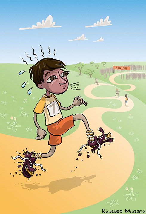
narrative illustrations for a school reader

illustration of a boy running in a race

illustration of boy daydreaming of being an athlete

inked sketch of boy running pencil draft of boy running


Just finished the illustrations for a school reader.
It was a narrative of hardship, cunning, triumph, kooky parents, and running shoes.
Here's a couple of samples.

R :)

Puzzle illustration - bush rangers in the fish and chip shop

puzzle illustration of bushrangers in the fish and chip shop


These puzzled bushrangers are from Puzzles Down Under, a book of mine which was published long, long ago in 2008. It featured puzzles, spot-the-items and mazes with an Australian theme and was written for 6 to 10 year old children.

Recently the rights for this book were reverted back to me. This is quite exciting as it means I can republish the book or publish individual images from the book without treading on the original publisher's toes. The artwork and text are once again mine to do with as I choose - I can sell the images as prints, put them on t shirts or post them on-line. 

Obviously there is the potential to use the existing artwork to make a fun puzzle ebook. 

Now it is my turn to be puzzled! I have never made an interactive ebook before so I am a little unsure where to start. I am hoping I can do most of it with Flash and Indesign.

Does anybody have suggestions, tips or thoughts about how to make an interactive ebook out of existing art? Any and all ideas are welcome!

R :)

cartoon megafauna t-shirts and kid's clothes


Megatherium tshirt


This 8 ton prehistoric American ground sloth gives very big hugs.

Glyptodon tshirt


A Glyptodon (South American giant armadillo) plonks itself down on a hapless Pudu (a tiny deer).

Thylacoleo tshirt


Thylacoleo, the Australian marsupial lion and one time terror of the outback, assails a moth.

Mammoth adventure tshirt


This Mammoth has its motor started, it is out and on the highway, it is looking for adventure. Oh yeah, whatever comes its way.

Zygomaturus tshirt


Zygomaturus, a prehistoric Australian marsupial swamp-cow takes ownership of the letter Z.


These t-shirts feature megafauna, a fancy name for large animals. All these particular megafauna have become extinct during the time modern humans have been around. Chances are you have ancestors who saw, ran away from or ate some of the following prehistoric beasties!

These designs are available via my Redbubble page where they can be ordered online and delivered to you. They are available as men's or women's t-shirts and hoodies and as kids sized t-shirts and clothes.

Original hand painted brush-and-ink artwork, scanned and coloured.
I designed these with kids in mind, but hey, if you are an adult and want to wear one that's okay too!

Tutorial - How to stencil print gift cards

stencil printed christmas beetle cards

A thorough step-by-step description
of how I print stencil art gift cards


People appreciate it when you hand make cards to give out for birthdays and Christmas time, but there just aren't enough hours in the day to make personalised cards for everybody. So as a happy compromise I hand print cards in batches.

Stencil art is simple, fun, inexpensive, and creates unique art with a lovely hand crafted finished result, so is a great print method to use for making cards. There are three parts to the process: making the stencil, preparing materials and surface for printing cards and printing the cards.

*WARNING* stencil art is addictive! Once you start painting it's hard to know when to stop. You might just start stencil painting every available surface at hand - wrapping paper, walls, pets, vehicles, family members, and so on.

What you will need to design and cut out a stencil
  • a pencil
  • paper to sketch on
  • a design concept! - a star, a fish, a face, what-ever takes your fancy.
  • some 'ezy cut stencil paper' and a ball point pen or acetate and a fine permanent marker
  • a sharp craft knife or good scissors
  • cutting mat

What you will need to print the stencil design onto gift cards
  • your beautifully cut out stencil design
  • nice thick card to print the design onto
  • paint - acrylic dries quickly, which is good
  • some water
  • a sponge or rag to paint with
  • a bench or table surface to print upon
  • old news paper or large sheets of waste paper to protect the bench or table
  • paper towel to keep things clean
  • somewhere safe the cards can sit undisturbed while the paint dries
  • envelopes for your cards

Designing and cutting out the stencil

Use the pencil and paper to sketch your design. It can be anything you like - a star, a word, a flower, a fish, a robot, a face, what ever you like. For my cards I designed a Christmas beetle, as it's a little seasonal without being religious or tacky.

christmas beetle sketch

Important!  Make sure you don't design any 'islands'. For instance, if you are cutting out a stencil of the letter 'A' you can't cut out the entire outside shape and then leave the middle bit of the 'A' remaining, as the middle bit will just drop out. That's an island folks! Instead, join the centre shape to the outside shape with bridges. The same applies to all stencil images, not just letters. Have a go, you will see what I mean.


When you are happy with your design, trace it onto some ezy cut stencil paper with a ball point pen (or onto acetate with a permanent marker). Trace using a lightbox, or tape the design onto a window and use the outside light to trace. You want your stencil paper to be bigger than the card you are printing on to, so you don't get paint on your card where you don't want it.

Now with your stencil paper on the cutting mat, slowly and carefully cut following your traced design, turning the stencil paper around as you go to make the cutting easier. Be sure to cut the corners cleanly, don't just wrench out the almost-cut shape.


A simple shape will take only a couple of minutes to cut out, a complex one can take an hours - seriously!

So now you have your beautiful shape cut out of stencil paper (or acetate) and are ready to start printing.


Preparing to print your stencil design

There are a few things to prepare before you start printing.

Make sure you have your cards ready to print on. A5 sheets of thick paper work well as they fold in half to make A6 cards, a common size easy to find envelopes for (use C6 envelopes). To make the folding bit neater and easier I 'score' or put a crease in the cards where they should fold by running the edge of a tea spoon firmly along the edge of a ruler.

Put down some newspaper or scrap paper to protect the bench/table surface you will be working on.

If you want the print to be in exactly the same place on each card you need to draw a placement guide on scrap paper to help you position your card and stencil during the printing process. The technical term for this is print registration. On top of a large sheet of scrap paper, line up your stencil design on one of the cards exactly where you think it should go. Trace around the edges of the card and then the edges of the stencil paper. You will now have two overlapping rectangles drawn on your scrap paper. Use this as a guide and every print will be in the same place.

Put a big glob of paint on a palette. For paint I use acrylic, as it dries quickly. Fabric paint works well too and comes in sparkly colours! For a palette I use a plate covered with tin foil, making it easy to clean up when you are finished.

Dampen your sponge with water so it is soft and malleable, but squeeze out as much of the water as possible. You don't want the water in the sponge watering your paint down as it will run under the stencil paper when printing.

Put your first sheet of card in place, and lay the stencil design over the top. Get it all lined up to print.


Put a swipe of paint on your sponge and dabble it up and down a few times elsewhere on the palette, to spread the paint evenly on the sponge surface.

Printing your stencil design

Let the fun begin! Hold down the stencil design onto the card surface with one hand and, using the sponge in a rocking, padding motion, apply the paint through the stencil and onto the card. Don't push down on the sponge too hard as it will push paint under the edges of the cut stencil shape, creating nasty blobs where you don't want them - just pat the paint on. You will get the hang of this.


When you have filled the cut out area of the stencil design with sponged-on paint, put the sponge aside and gently peel off the stencil paper. There you go, your first print! Now simply repeat until all your cards are done.


During the printing process use the paper towel to keep at least one hand clean of paint, so you can handle printed cards, transferring them to your drying space without finger-pints. I use a clothes drying rack to peg my prints up - keeps them neatly in a small space and out of the way. If using acrylic paint your prints will probably only need about a day to dry.

Once the printed cards are dry remember to photograph your efforts! Photographs of repeating printed artworks always look cool.


Now you only have to fold the cards, write in them (the hardest part of the process) and post them to friends and family - who will all be utterly delighted to receive them.

hand printed christmas beetle card

As you can see I made two-colour cards. This meant I had to print one colour onto all the cards, let them dry and then print the next colour over the top and allow them to dry again. So setting up print registration and allowing lots of drying time was important.

I also used multiple paint colours on the sponge at the same time, allowing the paint to mix on the actual surface of the print - bit arty, eh?!


Remember, this is just how I do it. Have a go, play and experiment, and see what works for you. 

Feel free to send a card to me!

This has been my very first tutorial, so if you like it or even if you hate it please leave a comment and let me know. Thanks.

R :)